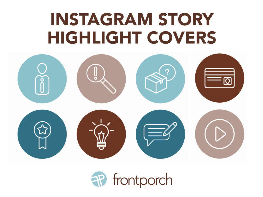
Seamless, sharp, and sophisticated. That is the vision that Front Porch Marketing has for you and your brand as we share why you should style your Instagram highlights.
With the right color scheme, design, and icons, you can drive more views and engagement with your Instagram bio at little to no cost.
If you are looking for a push to execute this vision and wow your audience the next time, they see your page, this is the blog for you!
The Vision
When you open up your company’s Instagram page, what is the first thing you see? Most likely, your eyes go to the colorful posts or maybe a bold profile picture with a strong branding icon, but acting as an overlooked middleman is a row of highlight icons. Currently, there may be as little as 0 or as many as 100 on your page – the sky is the limit.
Truly, the only limit that is regarded is that only up to 100 pictures can be posted within a story highlight, but highlights – much like a reel – should be seamless, sharp, and sophisticated and not fragmented, sloppy, and cluttered. Most importantly, they should be an extension of your brand’s story.
The Highlight
Many take a lot of time and effort to create the perfect “story” to post on Instagram. Whether it includes colorful gifs, a unique poll, engaging videos, or a giveaway you are extending a vision to viewers about your brand and its values. What is disheartening about all that time and effort is that it dwindles in significance alongside the 24-hour frame that stories are set on. Plus it requires the utmost strategic thinking.
Now, with story highlight reels you are able to make the stories on your Instagram stay permanently on your profile for viewers to enjoy at any given moment. By adding this extra step to your Instagram branding strategy, you are able to strategically use a prime location on your bio and create an immediate place of engagement with users.
Step 1: Be Seamless
What is great about engagement is that you can cast the vision for what viewers see and find different ways to resonate with them. For example, aesthetics are incredibly favored amongst millennials and are a growing target market for many companies. Thus, considering aesthetics on all social media platforms allows you to connect with this audience and others like it.
To create a seamless experience for users, use highlights to promote content that can showcase your products or services, express your brand, drive traffic and market your business. If your profile has bold colors, seamlessly transition the same color palette to your story highlights while also extending a nod to your brand as a whole. If your posts have a color scheme, extend it to your highlight to establish immediate brand recognition or go with a splash of color to draw in your audience with a double look. No matter what you choose, think about your brand as a whole and embody that within your highlight story covers – the first picture that viewers see on a highlight reel.
Step 2: Be Sharp
When it comes to your story highlight covers, always use high-definition content and think “succinct” when it comes to titles. There is a 10–11 character count rule of thumb when it comes to highlight covers. The more characters you use, the higher the chance that your highlight title will end up with an ellipsis instead of the word you were trying to promote. Whether you use CTA words like “events,” “promotions,” “sales,” or “giveaways,” be consistent and above all, do not be misleading in any way.
Step 3: Be Sophisticated
Last but not least, when it comes to Instagram story highlights create a look of sophistication. By using sites like Canva, Unsplash, and/or Pinterest, there are 100’s of highlight cover designs that are pre-made and ready to go at a moments notice for you and your company. No matter if you choose icons, HD pictures, graphic designs or a color palette, always keep your brand at the forefront.
In Conclusion
First, to bring your Instagram to the next level, revamp the look of your Instagram’s aesthetics with a seamless, sharp, and sophisticated look. Second, when it comes to highlight covers think about what story you want your viewers to plug into. Third, see your platform through the viewers eyes to see which highlights you want them to engage with first. In summary, bring the middleman to the forefront.
