Tag Archives: graphic design

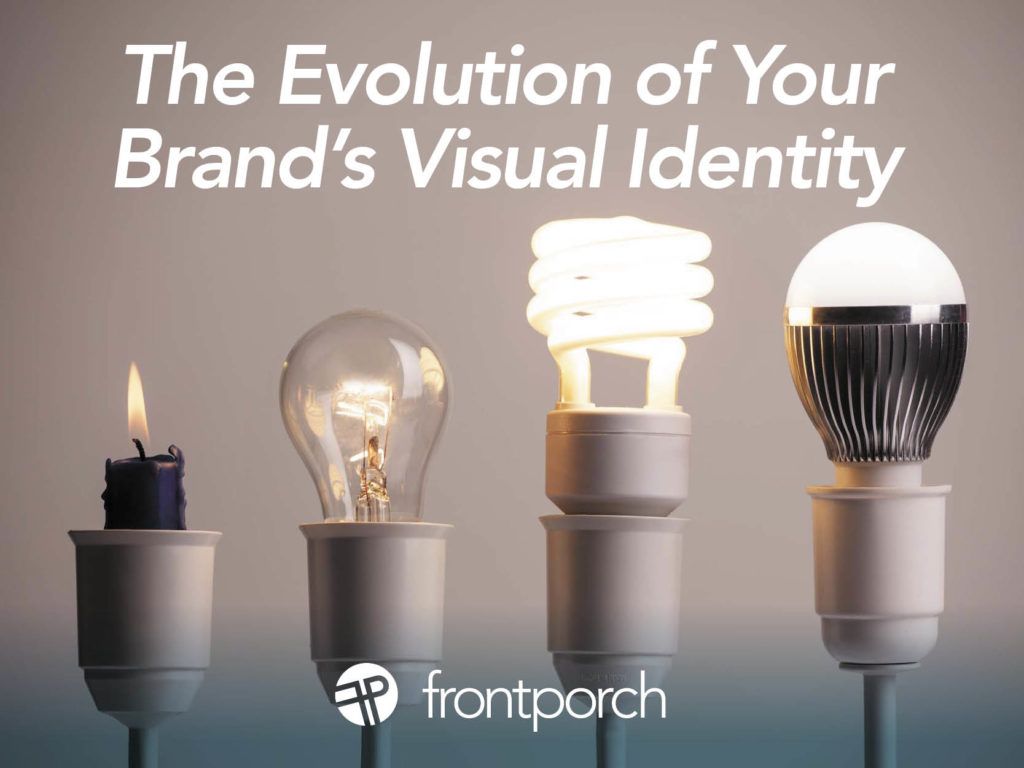
A brand’s visual identity is more than a logo or color palette —  it’s the visual representation your business’s values, mission, and personality. For small businesses and non-profits, a well-crafted identity builds recognition and trust. However, as these organizations grow and evolve, branding may need to change to reflect new goals, audiences, or offerings.

Why Evolve Your Visual Identity?

The decision to update or overhaul a visual identity often stems from growth or change. Here are key reasons a brand might evolve:

  1. Business Expansion: As businesses introduce new services or products, their branding may no longer reflect the full scope of their offerings.
  2. Shifting Target Audience: As the organization grows, its audience may broaden, requiring visuals that appeal to a wider or different demographic.
  3. Modernization: Visual trends change over time, and keeping a brand fresh ensures it remains relevant.
  4. Increased Professionalism: Many small businesses and non-profits start with DIY branding. As they mature, a polished identity can better reflect their level of professionalism, and dial up the credibility.

Key Elements of a Visual Identity

When evolving a brand’s visual identity, several components come into play:

1. Logo

The logo is the anchor of a brand’s visual identity. A redesign might simplify or modernize it while maintaining familiar elements for consistency. Updating or streamlining symbols can make a logo more versatile and contemporary.

2. Color Palette

Color evokes emotion and conveys values. Refreshing a brand’s color palette can help better align it with the organization’s current mission. Updating colors to align with trends can also modernize a brand’s visual identity.

3. Typography

Fonts communicate personality and tone. As businesses mature, they may shift from playful fonts to more professional ones. Introducing new fonts or pairing complementary styles can enhance both readability and brand perception.

4. Imagery and Graphics

Visuals, such as icons and patterns, help communicate the brand’s personality. Evolving these elements to align with the brand’s current focus ensures a cohesive look. For instance, non-profits may shift from abstract graphics to real-world photography as they grow their impact.

The Visual Identity Refresh vs. Rebrand

When evolving a visual identity, it’s important to determine whether your organization needs a refresh or a full rebrand. A refresh updates key elements (like colors or fonts) while keeping the core identity intact. This option is ideal for businesses looking to modernize without losing recognition. A rebrand is a complete overhaul, suitable for organizations undergoing significant shifts in their focus or mission.

Impact of a Refreshed Visual Identity

A refreshed visual identity signals growth and professionalism. It can attract new customers or supporters and keep your existing audience engaged. Modernizing your brand positions you as adaptable and forward-thinking, creating stronger emotional connections with your audience. Evolving with purpose is the goal.

For small businesses and non-profits, evolving a brand’s visual identity is about aligning with new goals and audiences. Thoughtful updates can amplify your message, improve recognition, and ultimately lead to greater success. Whether you’re expanding your business or growing your non-profit’s impact, evolving your visual identity ensures you stay relevant and resonate with the people you serve.


Finding inspirational websites when you’re designing for a brand can be tough, especially if you don’t know where to start. I have compiled a list of some of the best websites that you can use as a resource to give you some ideas when you’re stuck next project. 

Inspirational Websites For Branding

behance.net

Behance is a great resource to use if you want to see how some big designers display their portfolio. You can explore a wide range of creative projects, discover new trends, and get inspiration.

dribbble.com 

Dribbble is another great resource that is similar to Behance. It allows users to showcase their projects at any stage of their production. It is also great for UI/UX and web design trends. 

Typography Inspiration

creativemarket.com

Finding fonts is always time-consuming. They categorize fonts in certain styles so it is easy to find inspiration and the best fonts that fit your design needs. Creative market is a great place for not only fonts but other creative assets.

typewolf.com

Typewolf is a great resource for font pairings, and finding similar fonts that you like. It is also a great place to keep up with font trends and see the fonts you like on mockups.

Inspirational Websites for Overall Creativity

Pinterest

Pinterest is a great resource for all things considering branding. You can keep your ideas organized within your various boards and pins and even look at the boards of others. Once you find things that interest you, the algorithm is great at suggesting images that match your taste and interest.

Instagram 

Instagram is great for finding accounts that can give you inspiration on current trends and projects. Various accounts post their own projects or accounts that keep up to date with trends. There are also a lot of educational videos or posts that can help out with future projects. 

Color Inspiration

coolors.co

Coolors is a perfect website for all things color. You can generate your color palette as well as find colors that match your current colors. You can also explore color palettes that are trending. It is also helpful because it has all of the color codes you would need for a project. 

colorhunt.co

Colorhunt is also very similar to Coloors where you can generate your palette and explore others. You can also look up tones and hues that will give you various palettes of those colors. 

Finding Help From Inspirational Websites

Once you visit all of these websites, you’ll see that there are loads of resources out there to get you started, whether you are researching color, type, logos or branding. These resources can also be helpful when you’re trying to take your brand to the next level. Seeing what has been done, and what the possibilities can be can inspire you to create an even stronger brand.


Focus on your impression as a graphic designer

As a graphic designer, you are always focused on making brands for someone else. Listening to clients describe the vision and personality of their company, you then make a cohesive new brand that fits what the client described. It’s the same routine every graphic designer has experienced day in and day out.

But why do people say it is important to create a personal brand? Even though you are focused on creating and designing brands for someone else, you have to step back and focus on who is selling that work: you are. Your personal brand can demonstrate your strategic thinking and creativity to potential new clients. So what is your personal brand currently saying about you? Maybe its time to take it to the next level.

Break the process for yourself down into simple steps

Here are 5 ways to help you brand yourself better as a graphic designer, and benefit by standing out from the crowd this year. 

1. Define who you are 

One of the hardest things about creating your personal brand is defining who you are. But if you ask yourself some questions it could help you define it and put it into words. 

Out of all of your work, which is your favorite design that you have done?

As a graphic designer, what motivates you? 

Where do you excel? 

What do you want your clients to feel when they first discover you as a graphic designer? 

How do you present yourself every day? 

2. Establish your audience 

Who do you want your future clients to be? Try to build a personal brand that reflects the audience you want to work with. Look up fellow designers and see how they handle this themselves and market to their target audience (clients, agencies, etc). 

3. Study brands you like 

Just like you would research a company for a new project, take a look at other designers and creative agencies that you like. See what they are doing regarding their brand and take notes on how to enhance your own brand.

4. Image is everything 

Start creating social media updates that reflect your enhanced brand. Make a website where you can showcase all of your past designs in a personal branded format using such platforms as Behance and Dribble. Be judicious when you choose work to show off. You’ll want to highlight work that most reflects the work you want to do in the future.

5. Interaction on social media

Posting regularly about clients’ work or your personal work will give you a presence on social media. This way you can keep up with the audience’s reaction and trends in the design world. Keeping up to date with coworkers or potential clients gets your name out there. Building those connections can help you get future work opportunities.

Your new better brand will get you further

Once you brand yourself more effectively, you will have created a strong impression and help future clients know who you are. It can persuade their decision to work with you. Branding yourself as effectively as you brand your clients is a way to help plus-up your career and focus not only on the work you do now, but the work you want to do in the future.


Broadening your skill set is the key to success. That is what I have learned as an intern and college student so far. Success in your career depends on being skilled in more than one discipline. Graphic Design is something that I hold very dear to my heart, so I started college thinking this would be my path. My father is a graphic designer. Thus I have a personal connection to it and I’ve been practicing it for over four years.

Start With Something You Love and Broaden Your Skill Set for Success From There

Since I was a kid I would always look up to my father’s work as an artist. He graduated from UNT with a degree in Graphic Design and immediately got picked up by a respectable design firm. Throughout my life I would observe his work, how he brainstormed, his rough sketches, and then the final product.

Some of his work includes the live theater company called Kitchen Dog Theater and the Green Light to Greatness logo for The University of North Texas, that you can still see today on busses. He’s even done work for BNSF, the largest freight railroad network in North America! As a kid growing up I really looked up to him and thought he had the coolest job in the world. Being able to permanently leave your mark on the world and potentially change a company’s look sounded amazing. So, I decided at a very early age that I wanted to be a Graphic Designer.

Learn a New Skill Wherever You Can

I started by taking every art class I could from elementary to high school. When I reached high school, I decided it was time to start learning Graphic Design. I started by taking Graphic Design I, and Graphic Design II. Once I got confident enough in my skills I joined the school newspaper The Sidekick, and worked for them providing writers with illustrations.

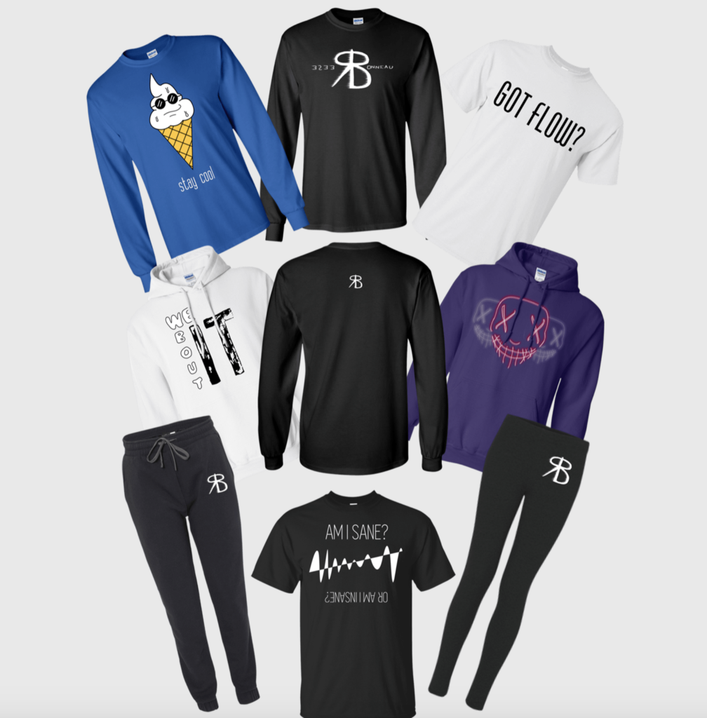
During this time, I also did a lot of work with Reese Bonneau, a local artist. I designed his album covers on Spotify and created multiple T-shirts for him to sell on his website. Now he has over 3K monthly listeners on Spotify! Through him I met other local artists and designed even more album covers. I like to help musicians and small companies just starting out. It allows me to get more experience, learn new things and grow.

You Don’t Know What You Don’t Know

Once I started college at The University of North Texas, I decided to major in Graphic Design like my father. It was a really tough program, but I was growing so much as an artist. But after one semester though, I decided that even though I love graphic design, I wanted to expand my skillset to a more business-oriented role. Being exposed to Marketing and Business caused me to pivot in my aspirations. I decided to switch my major from Graphic Design to Marketing. One of the most important things I learned in college: trying a bit of everything, meeting all kinds of people related to your industry, and taking new classes can help you discover your true path!

Now, my goal is to become a Marketing Manager for a big tech company. Currently, I still doing Graphic Design on the side. In addition to being an intern at Front Porch Marketing, I’m also the Graphic Designer and Social Media Manager for a start up Manga publishing company. Their mission is to provide a platform for up-and-coming manga artists and writers. We’re growing little by little every day and I think we’re off to a great start considering we started in January during a pandemic.

It’s OK to Change Your Mind and Try Something New

Even though I originally went to UNT to become a Graphic Designer, I have broader marketing and business goals now. I still love and practice it on the side when I can. But my focus is learning more about marketing and getting as much experience as I can with all aspects of marketing before I graduate.

There are so many different disciplines involved in marketing and I’m learning so much working as an intern at Front Porch Marketing. Every time I get an assignment I learn something new and grow in my confidence. Although I’m very focused on learning the digital aspect of marketing, I want to have a broad understanding of all the different branches, especially in the business management of marketing. I would love to learn how to create effective ads, do SEO, and email marketing. So I really look forward to growing with this company, as well as learning more at school this fall!


Seamless, sharp, and sophisticated. That is the vision that Front Porch Marketing has for you and your brand as we share why you should style your Instagram highlights.

With the right color scheme, design, and icons, you can drive more views and engagement with your Instagram bio at little to no cost.

If you are looking for a push to execute this vision and wow your audience the next time, they see your page, this is the blog for you!

The Vision

When you open up your company’s Instagram page, what is the first thing you see? Most likely, your eyes go to the colorful posts or maybe a bold profile picture with a strong branding icon, but acting as an overlooked middleman is a row of highlight icons. Currently, there may be as little as 0 or as many as 100 on your page – the sky is the limit.

Truly, the only limit that is regarded is that only up to 100 pictures can be posted within a story highlight, but highlights – much like a reel – should be seamless, sharp, and sophisticated and not fragmented, sloppy, and cluttered. Most importantly, they should be an extension of your brand’s story.  

The Highlight

Many take a lot of time and effort to create the perfect “story” to post on Instagram. Whether it includes colorful gifs, a unique poll, engaging videos, or a giveaway you are extending a vision to viewers about your brand and its values. What is disheartening about all that time and effort is that it dwindles in significance alongside the 24-hour frame that stories are set on. Plus it requires the utmost strategic thinking.

Now, with story highlight reels you are able to make the stories on your Instagram stay permanently on your profile for viewers to enjoy at any given moment. By adding this extra step to your Instagram branding strategy, you are able to strategically use a prime location on your bio and create an immediate place of engagement with users.

Step 1: Be Seamless

What is great about engagement is that you can cast the vision for what viewers see and find different ways to resonate with them. For example, aesthetics are incredibly favored amongst millennials and are a growing target market for many companies. Thus, considering aesthetics on all social media platforms allows you to connect with this audience and others like it.

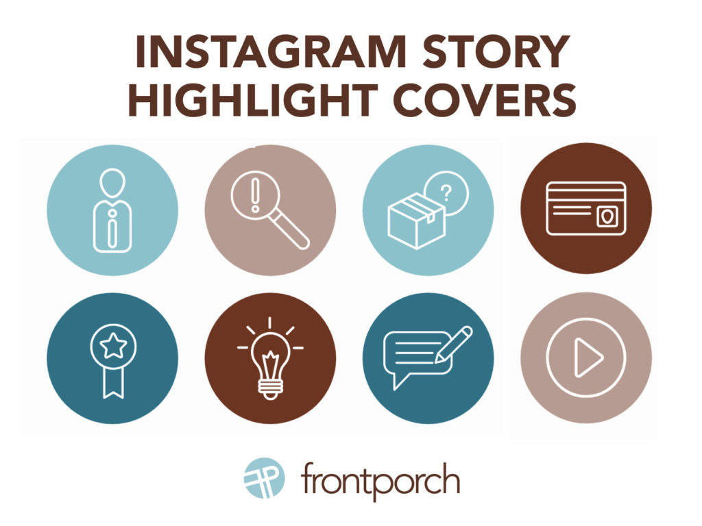
To create a seamless experience for users, use highlights to promote content that can showcase your products or services, express your brand, drive traffic and market your business. If your profile has bold colors, seamlessly transition the same color palette to your story highlights while also extending a nod to your brand as a whole. If your posts have a color scheme, extend it to your highlight to establish immediate brand recognition or go with a splash of color to draw in your audience with a double look. No matter what you choose, think about your brand as a whole and embody that within your highlight story covers – the first picture that viewers see on a highlight reel.

Step 2: Be Sharp

When it comes to your story highlight covers, always use high-definition content and think “succinct” when it comes to titles. There is a 10–11 character count rule of thumb when it comes to highlight covers. The more characters you use, the higher the chance that your highlight title will end up with an ellipsis instead of the word you were trying to promote. Whether you use CTA words like “events,” “promotions,” “sales,” or “giveaways,” be consistent and above all, do not be misleading in any way.

Step 3: Be Sophisticated

Last but not least, when it comes to Instagram story highlights create a look of sophistication. By using sites like Canva, Unsplash, and/or Pinterest, there are 100’s of highlight cover designs that are pre-made and ready to go at a moments notice for you and your company. No matter if you choose icons, HD pictures, graphic designs or a color palette, always keep your brand at the forefront.

In Conclusion

First, to bring your Instagram to the next level, revamp the look of your Instagram’s aesthetics with a seamless, sharp, and sophisticated look. Second, when it comes to highlight covers think about what story you want your viewers to plug into. Third, see your platform through the viewers eyes to see which highlights you want them to engage with first.  In summary, bring the middleman to the forefront.


You are trying to save resources and graphic design seems like something you, a team member or a marketing / communications professional can do.

You’ve worked hard to make your dream a reality. Of course, you want to ensure it is recognizable. The first rule of thumb? Build trust in your brand.

Building that trust requires a connection with your target audience. To achieve it, your creative execution must be constantly consistent. It is crucial to get it right.

Here are four tips:

  • Know what you need before you begin. Define your brand pillars to create a strong foundation. What is your brand vision, personality, positioning and affiliation?
  • Next, have a creative professional define brand colors, fonts and creative execution guidelines. Mind the brand.
  • Don’t settle. There are many programs that allow anyone to try their hand at graphic design. Use caution. Layout, font and colors are just a few of the key elements of graphic design.
  • Take your time. If you choose to DIY your brand creation, understand it will be a time-consuming process to get it right. Take the time necessary to not only learn what you want, but what you need. Learn the art of design.

Experience pays. In the end, it will save you time and money to hire a professional graphic designer. They have the programs and experience to communicate your brand. They will give you the exact guidelines to follow to easily remain consistent and help distinguish your brand from the competition.

Own it. Once you have chosen your brand architecture and standards, own them. Use them religiously. Don’t use your logo in one color scheme on one social media post, then alter it for another. Instead of a random mixture of colors, know and use complementary colors. Keep all of your design elements consistent – Every. Single. Time.

There is value in creative and graphic design. Be consistent and follow brand guidelines. If you don’t have consistency, you won’t build connection. Without them, you may as well do nothing at all.

In conclusion, have a partner or team with the experience and know-how to help you stay consistent. We’re ready to rock when you are.